

On the surface, brain science research and data mapping may seem like two methods of research very far off from one another. However, mapping data onto location is of interest to brain science and aging researchers. The Health, Brain & Cognition (HBC)Lab has recently explored Global Information Systems (GIS) mapping as a way to assess geographic representation in our studies, understand the effectiveness of community outreach efforts, identify areas at most risk for cognitive decline, and fine-tune recruitment of participants.
There are many examples of brain scientists using maps as an aid to their research or utilizing GIS mapping as the major focus of a study. GIS) mapping is a set of tools used to map data onto location. Chances are you’ve used GPS to navigate a new environment or opened up doppler radar to check the weather. Both of these applications map a certain type of data onto location, which are great examples of the uses of GIS mapping for everyday life.
The uses for GIS mapping are endless, from land/property records to in-depth research questions. States and cities use GIS mapping to make land and property records easily accessible to residents, and to create a quick and easy way to look up a piece of land and/or property. Other examples of GIS mapping are crime report maps, or other neighborhood information such as noise levels, or even pollution. When natural disasters such as wildfires strike, GIS mapping can show areas in critical danger, and where danger has been contained. Many studies have established that higher levels of education are reliable predictors of brain health. See Figure 1, a census tract map showing percentages of adults in the Iowa City area with less than high school education (includes the following HBC lab studies: BIKE, Brain EXTEND, AMBI/Midlife, BOOST-Observational, and BOOST-Interventional).
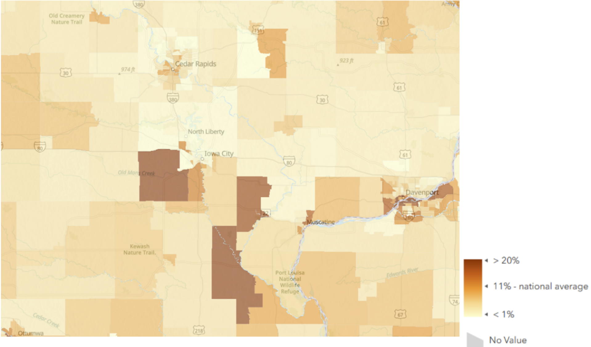
Usually, GIS data is live, and in real time. However, map data can be archived to educate the public on past events. Maps can also be morphed into a time series that can animate data over time. Obviously, GIS mapping is an extremely valuable tool to the general public.
Scientific applications of GIS mapping
In the past, researchers have used GIS mapping to study functional independence of elderly women and the association between where they lived, including degree of isolation, proximity to healthcare services, etc. (Bratanegara et al., 2025). Other researchers have used GIS mapping to investigate communities where older adults tend to live. This research group, in particular, studied many variables including noise, walkability, access to resources, and accident hotspots (Mena et al., 2025). Studies like these can assist with future neighborhood planning, especially with aging populations vulnerable to cognitive decline. More relevant to our research on brain health and aging, a group of researchers used MRI data from participants that had already been collected. They then mapped out neighborhoods where these participants lived and compared their scores on a brain health measure to the estimated normal population. They found associations between some communities lower in socioeconomic status and brain health (Wisch et al., 2023). Specifically, certain neighborhoods lower in socioeconomic status were associated with poorer brain health. They suggested that environmental factors could affect brain health, and that interventions might be better tailored to specific communities. This shows that GIS mapping can assist researchers in recruiting participants who are most at risk for cognitive decline and who may benefit most from intervention, and in turn, identifying areas for outreach involving education and opportunities for participating in interventions. Furthermore, GIS mapping studies can save taxpayer money by using the data multiple times, for distinct aims. This in turn can help us answer more questions and allow us to get more out of the data collected.
HBC Lab uses of GIS maps
The HBC Lab has recently explored the use of GIS mapping to conduct brain science research. We focused on two areas: where our participants currently live, and how we can use map data to aid future recruitment, outreach, and study design. In regard to where our lab’s research participants live, we have mapped the number of participants within nearby zip codes (see Figure 2). This has allowed us to visualize where we draw the most participants from. More importantly, we are able to visualize zip codes where we are lacking participant representation. The sample that we have contains over half of our entire participant base from studies ranging from 2014 to 2025. This initial look gives us a quick check on where we are doing well, and areas where we lack representation.
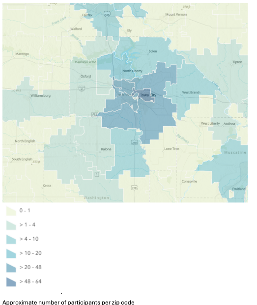
For the second goal, we have mapped variables to aid our recruitment efforts. For example, our participants are generally highly educated and come from urban areas. For future research studies, it will be important to better represent rural areas and a wider variety of education levels. Throughout our investigation, we looked at these demographic variables of interest, and how they map onto our area. To our surprise, we have identified areas that overlap with multiple goals. For example, we have identified certain zip codes that are associated with lower high school completion rates, fewer residents with college degrees, and rural environments simultaneously.
Another method that has the potential to aid in understanding whether our research is inclusive to those most at risk for cognitive decline is looking at Area Deprivation Index (ADI), a measure of socioeconomic disadvantage. This validated measure is made up of 17 individual variables and is heavily utilized in research. Our lab utilizes GIS mapping to look at ADI levels in our local area, as well as other collaborating metros like Boston and the Dallas-Forth Worth areas (See Figures 3-4). GIS mapping of ADI levels can assist with our studies in the moment, as well as in preparation for future collaborations. After a study is completed, looking at where participants came from enables us to get a glimpse of how diverse our participants are in terms of socioeconomic status. Looking at ADI levels can also be helpful in identifying areas lower in ADI (more disadvantaged), and ensure we are recruiting to a wide range of participants. In the future, mapping variables such as ADI will help identify areas of priority well before recruitment starts. This can ensure a plan of action is in place so recruitment can be off to a fast start, saving valuable time and limited resources.


While one goal of our outreach efforts focuses on research study recruitment, another goal is to get information about brain health out into the public. This last year, you may have noticed many new outreach efforts such as appearances at community events and farmer’s markets. You also have noticed that we have increased the number of public presentations led by Dr. Voss. We have placed high emphasis on getting out into the community and giving information to a variety of areas. This includes populations and areas at risk of cognitive decline and sedentary lifestyle. By looking at ADI maps, we can not only understand who is most at risk that is not represented in our studies, but also for potential places to hold public presentations about brain health.
In sum, GIS mapping can be used not only to help our lab reach outreach goals, it can help us better inform the public about our research findings.
Future applications hold promise
For the future of our GIS mapping research, we hope to accomplish a few things: first, we hope to use these zip codes and neighborhood maps to fill gaps in participation. Second, we hope to expand our outreach to underrepresented areas such as rural areas or community centers. Third, we hope to gain access to more unique (and up to date) datasets and further separate maps into specific age groups tailored to specific research projects. For example, our BOOST Observational study asked participants about barriers to physical activity. GIS may allow us to create maps showing neighborhoods most associated with barriers in the built environment. We have conducted large-scale clinical trials with older adults as well as middle-aged adults.

These two distinct groups could be concentrated in different areas, and different methods of outreach may be necessary to reach them both. Different outreach methods tailored to distinct groups of participants could further allow us to be more efficient with higher scientific and community impact, especially when these methods can be quite expensive.
The possibilities of GIS mapping in research seem to be endless. GIS mapping is an inexpensive, effective tool that can be used for a variety of applications in research. So far, we have summarized where our participants come from and identified underrepresented areas. We have focused on areas that are likely to have participants to further enrich our data. We now have a clearer path forward for the future of outreach and recruitment. It is our hope that we will expand our lab’s footprint and outreach efforts with the help of GIS mapping. Perhaps in the future we will conduct new studies focusing on brain health with the heavy use of GIS maps. Or we may publish user-friendly maps containing data on brain health in our area. Since the future is so bright for GIS mapping, we have only scratched the surface of what we can accomplish using this important research method.
References
Bratanegara, A., Pitoyo, A., Widayani, P., & Hizbaron, D. (2025). Geospatial Disparities in Elderly Health: A GIS-Based Study of Functional Independence in Tasikmalaya Regency, Indonesia. International Journal of Geoinformatics, 21(9), 17–36. https://doi.org /10.52939/I jg.v21i9.4439
Emily Mena, Janissa Altona, Christoph Teves, Benjamin Schüz, Karin Wolf-Ostermann, Mapping Dementia-Friendly Urban Environments in Bremen Using GIS: Insights From the Den-HB Project, Innovation in Aging, Volume 9, Issue Supplement_2, December 2025, igaf1 22.1153, https://doi.org/10.1093/geroni/igaf122.1153
Kind AJH, Buckingham W. Making Neighborhood Disadvantage Metrics Accessible: The Neighborhood Atlas. New England Journal of Medicine, 2018. 378: 2456-2458. DOI: 10.1056/NEJMp1802313. PMCID: PMC6051533. AND University of Wisconsin School of Medicine Public Health. 2015 Area Deprivation Index v2.0. Downloaded from https://www.neighborhoodatlas.medicine.wisc.edu/ July 16, 2026
Wisch JK, Babulal GM, Petersen K, et al. A practitioner's guide to geospatial analysis in a neuroimaging context. Alzheimer's Dement. 2023; 15:e12413. https://doi.org/10.1002/dad 2.12413